
Concept
Axiom
Turning infrastructure into an idea people can see.
Axiom is a fictional deep-tech platform: a control plane for distributed infrastructure. This study is a scenario, not a client engagement. It asks how a company with genuine technical depth can stop looking interchangeable with every other dark-mode dashboard in the category.
Information architecture · Product storytelling · Enterprise design system · Interactive diagrams
The scenario
Axiom is treated here as a control plane for compute, network, and policy across regions. The brand has deep engineering culture and almost no public narrative. Competitors occupy the same charcoal UI, the same cyan graphs, the same promise of “visibility.”
The study assumes no paid media win and no invented conversion rate. The design hypothesis is narrower: if a visitor can hold a model of the system in their head, the sales conversation starts at a higher altitude.
The challenge
Infrastructure products fail in public for a structural reason: the value is relational. A feature named in isolation is indistinguishable. A topology — identities, policies, workloads, signals — is the actual product.
Most sites in the category hide that topology behind metaphor or bury it in documentation. Neither helps a cautious buyer. Metaphor feels like marketing. Documentation feels like homework.
Audience and objective
Primary: a director of platform engineering who has been burned by tools that demo well and operate poorly. Secondary: a CIO who needs to believe the vendor is durable, precise, and not a science-fair.
The site must feel like an instrument, not a campaign. Credibility is a material choice: mineral dark, restrained luminosity, type that behaves like specification, diagrams that can be interrogated with a keyboard.
Strategic reframe
Axiom is not “observability” or “the fabric of the future.” Axiom is a way of seeing a living system. The homepage should not shout benefits. It should present a model, name the parts, and invite the visitor to pull one relationship into focus.
Every subsequent page is a zoom into that model: product areas as regions, proofs as traces, documentation as the same language at a different resolution.
Content architecture
The narrative is a descent: gravity of the problem, the model, the control points, the operating cadence, then proof and next step.
Page types are few: Platform (the model), Control (identity, policy, workload), Operate (signal, change, incident), Proof (architecture notes — labeled as hypothetical), and Start. Documentation is not a separate visual world. It inherits tokens, type, and diagram language so the marketing site does not lie about the product site.
Art direction
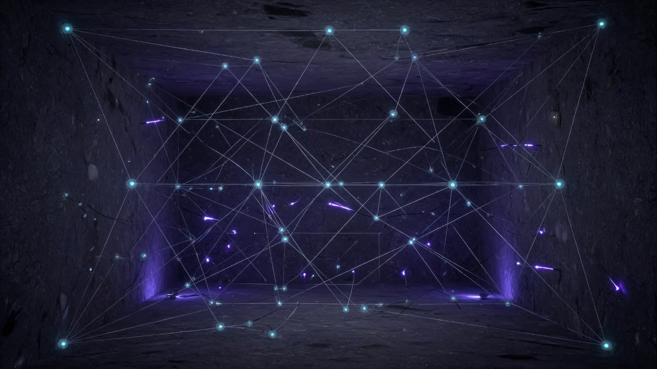
A dark mineral field, not a generic black. Luminous signal is used as an event — a selected node, an active trace — never as wallpaper. Construction lines describe relationships. Type is precise: a geometric sans at text sizes, with tabular figures for anything that looks like a value.
No planets, no circuit-board clip art, no endless particle globe. If a diagram is spatial, it is a model of the product, budgeted like a UI component.
Interaction and motion
Motion explains relationship. Nodes attract when a control is focused. Traces draw after the visitor asks, not as decoration on load. Camera moves are small and reversible.
The interactive diagram is a first-class control: arrow keys move between nodes, Enter opens a definition, Escape returns to the model. Reduced motion replaces interpolation with crossfades between composed states. The meaning is identical.
Design-system excerpt
Tokens encode density, signal, and caution rather than a rainbow of brand colors. Surface levels are named after field, plate, and instrument. Diagrams share the same spacing rhythm as forms, so a control plane screen and a marketing module feel related.
Components are built for long proper nouns and awkward real data. A card that only works with three-word headings is rejected.
Responsive treatment
On a phone the topology becomes a vertical stack with a persistent minimap, not a pinch-and-hope canvas. Definitions sit in a sheet. The model remains inspectable because the information architecture was designed for this, not squeezed into it.
Accessibility and performance
The canvas is decorative to assistive technology; the model exists as a list and a definition pattern. Contrast is verified on mineral surfaces, including selected and muted nodes.
Interactive diagrams are an enhancement. The first paint is typography and the primary control. Extra motion may arrive later. It must never shift the layout when it does.
What this study demonstrates
This study demonstrates how a deep-tech company can be made legible without being simplified — diagrams and motion serving a buyer’s understanding rather than a studio’s reel. It is a design hypothesis, not a measured result. No client commissioned it, and no conversion outcome is claimed.